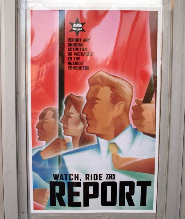

Someone has sent me a couple of public security posters - one from from Baltimore, another from London. Odd that both have got such a distinctive mid 20th century style to them, immediately suggestive of totalitarianism and Orwell's (as opposed to Channel 4's) Big Brother.
I remember seeing the London Transport ones a couple of years ago (bloody good idea, CCTV on buses). I wonder if the same design consultancy / ad agency was behind the campaign?
ReplyDeleteLike it!
ReplyDeleteGiven that these posters are in both Baltimore and London, I can't believe it's the same ad agency. I think some sophisticated post-structural semiotic analysis is called for.
Yeah, different ad agency - here's the link to the Robin Shepherd Group who produced the "Watch, Ride and Report" and no sign of Transport for London in their client list.
ReplyDeleteI can only think that the purpose of using retro-style posters is to place some kind of ironic distance from the message itself, albeit without going as far as satirizing or fatally undermining it. It provides a sort of jokey way of making a serious point, in contrast to a more literal warning which would be in danger of seeming hysterical or tyrannical.
ReplyDelete